Role & HR Template
Results & Learnings
INTRODUCTION
Before diving into the product itself, it is essential to understand what Bizagi is, what services it offers, and how Sites fits into this ecosystem.
Bizagi is a company that helps organizations optimize their internal operations, improving efficiency through a workflow modeler. With this tool, users can design their own diagrams, test their effectiveness, and test its efficiency.
Additionally, the modeler allows for responsibility management, and workload assignment because it provides a 360° view of all stakeholders involved in a given context.
OVERVIEW
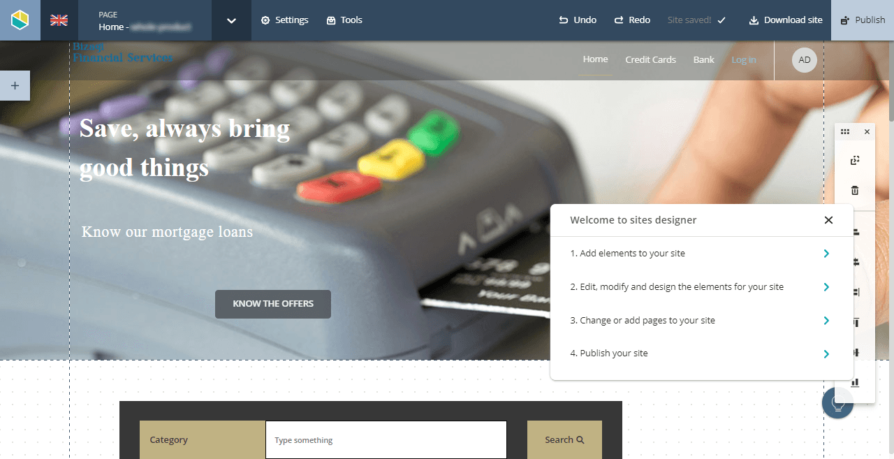
With Bizagi Sites, we aimed to provide users with the ability to customize and design their own work portals through a no-code designer that could adapt and respond to different aesthetic and functional use cases.
We already handled a lot of information from clients' workspaces; however, for users to visualize and work with that data, they had to leave their digital environment and continue in Bizagi’s, completely changing the interface where they had been working and changing the behavior of the components and elements with which users interacted.
However, the current state of Sites was far from delivering the modernity, usability, and aesthetics we intended to offer.
The main problems we faced were:
• Outdated and old-fashioned UI.
• Limited components and controls.
• Design restrictions.
• Disorganized grouping of elements and components.
• Lack of consistency with the Design System (DS).
📌 If you want to learn all about the UX case Study and how it interacts with this case study, check it out here:


THE CHALLENGE
While Sites addressed some user needs, there was a significant gap in features and functionalities, which needed to be represented with a more modern and flexible aesthetic.
An intuitive site designer, visually appealing, flexible enough for users to customize their creations down to the smallest detail, and at the same time, it needed to have a very well-established definition so the freedom of management did not make the product's usability unviable.
The challenge was to define a gradual and continuous development approach that would improve usability and enhance the overall user experience without compromising the usability already achieved.
The proposed changes included:
• New logo design.
• New color palette.
• Updating and replacing components.
• Redesigning menus.
• Regrouping elements.
• Creating new components.
• Standardizing interaction states (active, focus, disabled, default).


UX - UI ROLE
To define the roadmap and prioritize needs, I started with a diagnostic phase, analyzing the tool’s current state and identifying usability pain points. Then, I expanded my research to understand how users interacted with Sites.
I designed UI components for the sites creator, such as specific typography, color themes, graphical elements, cards, images, embedded videos, backgrounds, footers and different types of menus.
As well as the creation of components designed for task management, data visualization, and actionable elements, such as a PDF viewer, tables, charts, menus, and cards that integrated with the repository information.
This included conducting user interviews, creating user personas, and designing a prototype for a HR use case, ensuring that it could be implemented with Sites’ features.


HR TEMPLATE
By creating the template and three user flows, I was able to understand which components were lacking on our platform.
An HR partner responsible for creating and reviewing job vacancies, an active worker seeking to change roles within the company, and an HR director needing a global overview of the current job vacancy status in the company.
With this I identified the frustrations users faced with the current platform, the difficulties in designing a new site, and the need to create new controls for data reporting and visualization.
The process and key findings
• Conducted research sessions
• 7 users interviewed
• Created 3 User Personas
• Defined and designed a new color palette
• Redesigned menus and graphical components
• Updated language and tone of voice
• Raised tickets for task prioritization
• Held QA sessions with the dev team to ensure consistency.
• Validation sessions with other designers for knowledge share.
• Developed prototypes and user testing
• Documentation of qualitative and quantitative data
📌 If you want to play with the HR Template and the 3 Personas you can do it here:


RESULTS
The entire process of design, testing, and implementation lasted approximately two years, time during which Sites underwent changes from its corporate colors to its usability and behavior.
Similarly, it evolved from a fixed product to one that was fully responsive and flexible enough to continue evolving according to any needs that might come.
Sites underwent an almost complete redesign with substantial improvements in usability and perception.
Throughout the process, all controls underwent a redesign and improvement phase; cards, carousels, images, and interactive components like videos, carrousels, iframes, among others, which were graphically and behaviorally incorporated into the design system.
Key results:
• New logo.
• New color palette.
• Redesigned menus and taxonomies.
• Standardized states for buttons and interactive elements.
• 10+ new controls and components.
• Implementation of a “universal” and accessible color palette.
• Sites to go live with over 200,000 active users.
Thanks to my work with the product, we managed to go into production, with ADIDAS and DHL as first users, and expanded it by working with more than 200,000 users who currently interact with the platform.
📌 If you want to learn all about the focus from a product UX perspective check the Sites Case Study project in this link


LEARNINGS
The redesign and enhancement process was a constant learning experience. Collaborating with designers, developers, product managers, and other teams helped me grow professionally and improve my soft skills.
Additionally, I gained valuable experience in leading a design process from start to finish, staying involved in all stages to ensure a seamless execution.
NEXT CASE
NEXT CASE
NEXT CASE


Sportstech: Taxonomy Design & Sports
Sportstech: Taxonomy Design & Sports
Sportstech: Taxonomy Design & Sports
Product Design Case
Product Design Case
Product Design Case
LIKE WHAT YOU SEE?
LIKE WHAT YOU SEE?
LIKE WHAT YOU SEE?
LETS WORK TOGETHER
LETS WORK TOGETHER
LETS WORK TOGETHER
This could be the start of something great, send me an email so we can get to know each other.
This could be the start of something great, send me an email so we can get to know each other
This could be the start of something great, send me an email so we can get to know each other.
